The Walthamstow Tapestry
by Grayson Perry, 2009
In 2009 Perry had a solo show at the Victoria Miro Gallery to coincide with the publication of the first major monograph on the artist by Jacky Klein. When discussing the exhibition and book launch, which were to take place in the vast upstairs gallery at Miro, Perry, half-jokingly, said that he ‘will make something to fill’ the 20m long back wall. Around the same time Charles Booth-Clibborn introduced Perry to the tapestry technology, which Booth-Clibborn had seen examples of at Adam Lowe’s Factum Arte in Madrid. Perry was immediately attracted by the possibility of working on the large scale that the weaving technology afforded him.
It took Perry about three months to make a black-and-white line drawing of the tapestry’s design. This was done on a quarter scale, as this meant that his pen line, when scaled up four times would leave a thick enough mark to be legible once woven. Perry drew on seven separate A1 sheets that he had then scanned locally in London. Working with these scanned files on his computer Perry then added all the colours. The resulting files were sent to Factum Arte in Madrid, where the seven sections were joined and fitted together digitally by Adam Lowe and Blanca Nieto. Scanning artefacts were removed and some of the writing corrected to ensure that it was legible in both the small and the large version of the tapestry.
The tapestry itself was woven at Flanders Tapestries in Belgium using Jacquard weaving technology. Marcos Ludueña-Segre translated the files prepared by Factum Arte into a weave file, the command file for the loom. A tapestry is made of warp and weft threads interlaced with each other. The warp is the set of yarns placed lengthwise in the loom, which are crossed and interlaced by the weft yarns. The sequence of how the weft threads cross the warp yarns is determined by the Jacquard mechanism, which moves each warp yarn up and down following the weave file. Fourteen different colour yarns were used to weave The Walthamstow Tapestry – two shades of grey for the warp and 12 primary colours for the weft. The visible colour of the fabric is determined by the way the chosen yarns are shown or hidden in the structure of the fabric. Weaving the primary colours in a specific pattern produces different shades of colour. Jacquard technology relies on the fact that the human eye optically blends the various yarn colours, thereby allowing the imitation of a myriad of apparent different shades using just a few primary colours.
In order to determine the right matching colours for Perry’s drawing, Flanders produced colour charts containing several hundred small patches of colours all identified by different numbers. For the initial colour proofing a selection of fragments of the tapestry drawing were woven and the colours chosen and corrected by Lowe. Once Lowe was happy with the proofs, the first of a number of meetings with Perry was set up in London. Over a period of two months Lowe either met with the artist or sent new woven samples, and gradually the optically-mixed colours and the character of the weaving were adjusted to get the subtle balance between the cream colours and acidic greens that Perry had intended.
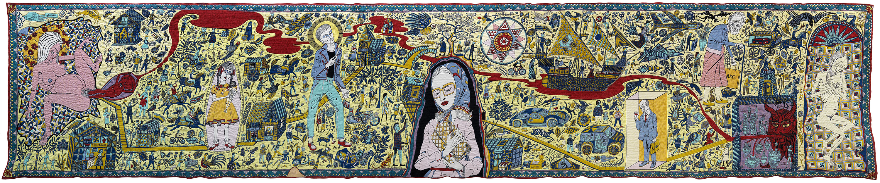
The initial idea for the colour range came from a book on Sumatran batik. Perry liked ‘the strange little scenes depicted’ and the unique flavour of ‘a bit of early Italian fresco painting and folk art’. The theme of the tapestry is the Seven Ages of Man, from birth on the far left to death at the opposite end of the tapestry. Perry introduces the ages with a very graphic birth scene, where the mother clutches a blanket as she gives birth to a crimson infant. From this agonizing scene a river of blood runs all the way through to the other end of the tapestry. Childhood, a girl labelled Coca-Cola holding a naked puppet of Christ in place of a doll, takes the guise of a younger version of Perry’s alter ego Claire. Perry misappropriates another religious symbol in the figure representing adolescence, a haloed 1960s rocker flaunting a knife. The focal point and centre of the composition is what Perry calls the ‘Madonna of the handbag’. Clasping a handbag to her bosom, Perry, not without irony, lets her shed a tear, probably because ‘she got to the top of the waiting list for her hand-made handbag’. For Perry handbags are ‘the quintessential consumer product, in that they are the first thing you see when you enter a department store – the it bag – almost sold as sculptures’. Consumerism, brands and the sway they hold over contemporary culture have long fascinated Perry. Across the entire tapestry Perry scattered over 200 famous brand names. These are often randomly and sometimes absurdly combined with strange, seemingly everyday life scenes. A blind woman labelled Guggenheim, is led by her guide dog Sotheby’s. A huntsman is labelled Aldi and a baptism scene in the river of blood Red Bull. Perry stripped the brands of their logos and associated imagery, thus leaving only ‘the emotional resonance of the brand rather than a literal advert. The word just gives you a little sugar rush of emotion that is connected to it. The incidents in the tapestry are loaded up with a collage of feelings that are associated with the different products and services, like a great parade of marketing that has been invading our heads’. Middle age is a ‘defeated commuter, despondent, just come home and has his first glass of wine’, and old age a granny with a hunchback carrying a shopping bag labelled BBC. Perry ends the life cycle with a reference to another religious motif, the Man of Sorrows. The plethora of imagery and words is something that Perry deliberately uses to give the viewer the opportunity of getting lost in the detail. He likes the idea that ‘by the time you’ve seen it all you have forgotten where you started’. Perry named the tapestry after the district of London where he has his studio, Walthamstow, the birthplace of William Morris who ‘liked a bit of tapestry’. At the same time this deliberately matter of fact caption also brings to mind its most famous medieval precursor – the Bayeux Tapestry.
Brands are stripped of their logos and associated imagery, leaving only 'the emotional resonance of the brand, rather than a literal advert. The word just gives you a little sugar rush of emotion that is connected to it. The incidents in the tapestry are loaded up with a collage of feelings that are associated with the different products and services, like a great parade of marketing that has been invading our heads.'
Grayson Perry